Marketing Tips for Small Businesses
Tip #1 – Maintain consistent brand awareness. Does your website domain and social media handles all match up? If not, …

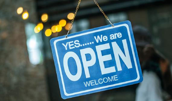
A professional well-designed logo is essential to any company. It’s often the first thing potential customers see when they are introduced to your business. Over time, your logo becomes the main identifier of your company. Whether on your website, business card, social media page, or store front sign, your logo has to be great! Here are 5 things to avoid when designing or redesigning your company’s logo.
Choosing the right font for your logo can be tricky. There are literally thousands upon thousands to choose from, so it can be a daunting task to find the best one for your logo. The font or fonts chosen should fit the theme and feel of your overall business. What you never want, however, is to incorporate a font that’s just overused. Here are a few that fall into that category:
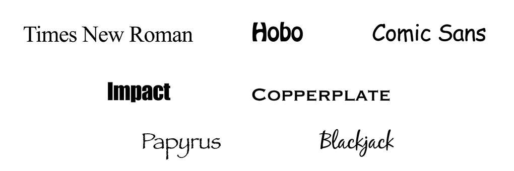
Did you immediately recognize some of these? That’s why they don’t belong in your logo. While there is nothing inherently wrong with these fonts, they have been used so much that they come across as almost kitschy and cheap. There are so many other choices that will be a better fit for your logo and business.
There is a time and place for clipart, but it’s never in your logo. Clipart makes your logo look unprofessional and dated. Choosing custom graphics and illustrations is always the smarter choice.
An effective logo should be concise, easy to read, and quickly recognizable at a glance. Cluttering up your logo with too many elements and colors is a distraction and can make your logo ineffective.
While it’s fine to get inspiration and ideas from other logos, copying them is never okay. Don’t be the business whose logo resembles that of a major restaurant chain. Not only is it unoriginal and tacky, it also opens the door for a major lawsuit.
Once your logo is finalized, it’s always helpful to have it delivered in several different formats and orientations. This includes different file types, both raster and vector. A black and white version or a single color version may be needed at some point depending on the application. If possible, a horizontal and vertical layout of your logo can be beneficial as well. A professional, well-designed logo should be ready for any situation!
Do you need a new logo or just an overhaul of your existing one? Call or email OmniMaze today, and let’s get started!
Tip #1 – Maintain consistent brand awareness. Does your website domain and social media handles all match up? If not, …
Tip #1 - Keep it simple. It’s very easy to clutter up your ad with too much text and busy graphics. Each ad should be …
Tell us what you need - we can’t wait to hear from you!
CONTACT US833-OMNIMAZE
